PRISM · Mockup Gate · P6
Stamp — Pick a Layout
Three directions, all using Route brand tokens. All passed taste + UX critics. Pick one — or blend ("C calendar + B day panel").
Research ✓›
Vision ✓›
Brand ✓›
Mockup ← you are here›
Spec›
Implement
tasteAPASS
uxAPASS
tasteBPASS
uxBPASS
tasteCPASS
uxCPASS
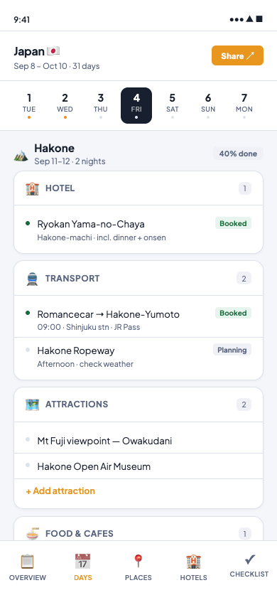
Direction A
Timeline
Day strip at top, 6 category cards per day. Mirrors Excel column structure exactly.
taste ✓ux ✓3 flags
- Zero learning curve from Excel
- Booking status unmissable
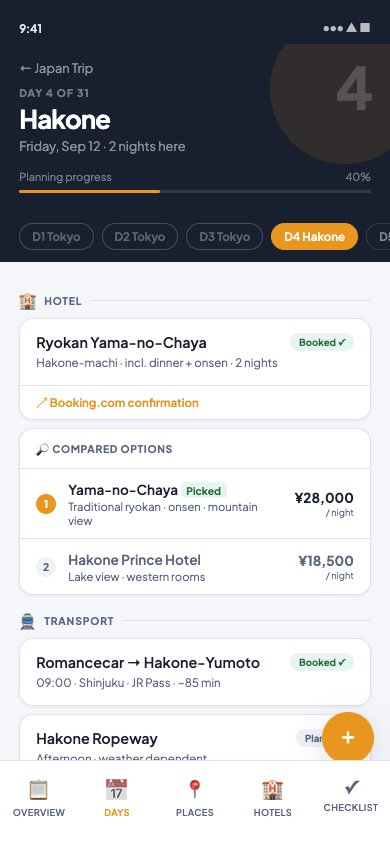
Direction B
Day Canvas
Navy hero + destination name + feed layout. Hotel comparison inline. Premium feel.
taste ✓ux ✓3 flags
- Immersive destination-first feel
- Hotel comparison solves real need
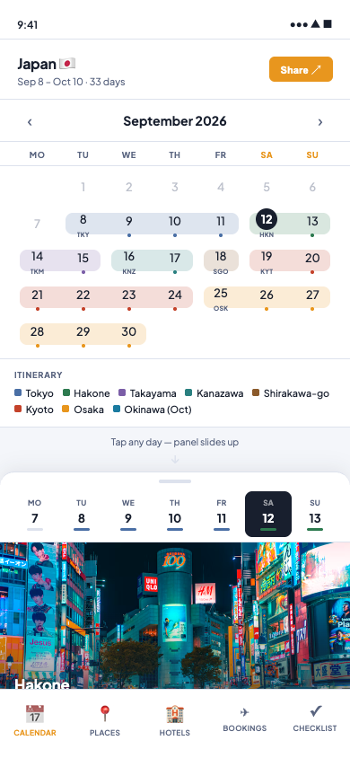
Direction C · New
Month Calendar
Full month grid with region spans. Tap day → panel slides up with week strip. Tripsy/Apple hybrid.
taste ✓ux ✓3 flags
- 31-day itinerary visible at a glance
- Replaces the Excel calendar sheet directly
- Week strip for fast day-to-day nav
Production flags (all 3 directions, fix at Implement)
Emoji category icons → replace with SVG icon library
Bottom nav: add env(safe-area-inset-bottom) for iPhone gesture bar
Day cells (C): increase to min 44px height for Apple HIG
Entry rows (A/B): increase to min 44px tap height
A, B, C — or a blend?
You can pick one direction, or describe a blend: e.g. "C calendar + B day panel" or "C calendar + A card sections". The pick locks the Spec contract.
Route brand tokens (navy · amber · Plus Jakarta Sans) are locked — this pick is layout only.