PRISM · Mockup Gate · P6
Stamp — Pick a Layout
Two mockup directions for the Day Detail screen, both using the approved Route brand tokens. Both passed taste + UX critics. Your pick locks the visual contract before Spec.
Research ✓
›
Vision ✓
›
Brand ✓
›
Mockup ← you are here
›
Spec
›
Implement
taste-skill A PASS
ui-ux-pro-max A PASS
taste-skill B PASS
ui-ux-pro-max B PASS
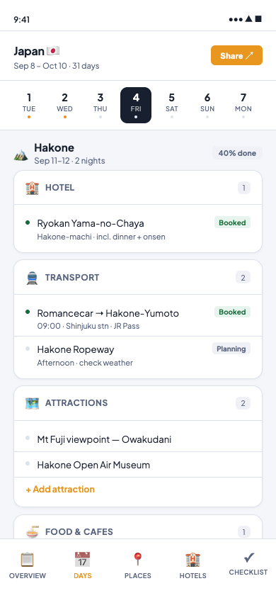
Direction A
Timeline
Sticky day-chip strip + 6 structured category cards per day. Status as dots + pills inline. Very close to the Excel mental model.
taste PASS
ux PASS
3 minor flags
- Mirrors the Excel column structure 1:1 — zero learning curve
- Day-completion dots show planning progress at a glance
- "Book now" urgency is unmissable
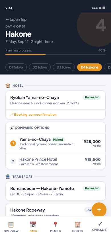
Direction B
Day Canvas
Immersive navy hero with destination + progress bar. Feed layout (divider + entries) is airier. Hotel comparison panel inline. FAB for adding.
taste PASS
ux PASS
3 minor flags
- Navy hero gives the trip an emotional, destination-first feel
- Hotel comparison panel solves a real need — why did we pick this?
- Feed layout is faster to scan than nested cards on mobile
Flags to fix at Implement (not blocking the pick)
Emoji category icons — replace with SVG icon library (Phosphor / Tabler) in production
Bottom nav: add safe-area-inset-bottom padding for iPhone gesture bar
Entry row tap targets: increase to min 44px height for Apple HIG compliance
Day chips (Direction B): increase pill padding to hit 44px touch target
Which direction do you pick?
Reply A, B, or a blend ("B hero + A card sections"). Your answer locks the visual contract for Spec and Implementation.
Brand tokens (Route palette + Plus Jakarta Sans) are locked — this pick is about layout / feel only.